Microcopy is the small pieces of written content that help users navigate and use your online forms effectively. Writing microcopy for your online forms is hard.
All so users feel comfortable filling in your checkout form and don’t experience any mental strain doing so.
Content strategist, Bill Beard, describes microcopy as,
“[]the little text that can make or break your user experience.” – @writebeard
Here are some good examples you should go ahead and steal for your own forms:
Microcopy has a big job to do sometimes. What could be communicated without words via design could save space on the page. However, worldwide 8% of men and 0.5% of women have a colour vision deficiency. Another 39 million are blind and 246 have low vision so communicating with visual-only cues isn’t inclusive.
Here are two examples of shopping delivery calendars. Each have ‘green’ options, where the delivery vehicle will have lower environmental impact:

Source: Ocado.com
Only one of them communicates the ‘green’ option without colour though:


Source: Gov.UK
“Before you start…You’ll need to:..”
This isn’t quite ‘micro’ but the copy that precedes this form prepares users well, specifying restrictions and required documents users should have to hand.
Apply this forms where users will have to enter card details, provide travel documents for travel or simply will need to enter their membership number.

“E-mail Address:”“(This will be your username)”
Email addresses can be used for login, without asking users to think up an original username. It saves mental strain at the signup point and every time they log in. What I like even more, in the example above, is that the signup form clearly explains that’s how it will work.

“You will have the opportunity to save your information for a future visit.”
Another great way to speed up signup forms is not to force users to sign up before they complete their purchase. Some guest checkouts are introducing post-purchase sign up. Microcopy can convey that users are free to progress through the checkout without restriction.
The example above doesn’t mention ‘creating an account’, it subtly keeps all the focus on the benefit to the user, framing it as an ‘opportunity’ and alluding to future purchases.
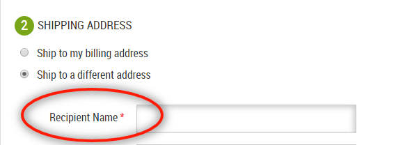
“Recipient Name”
CafePress, like many other ecommerce sites, allow shoppers a different shipping and billing address. Knowing the order could be for someone else, they’re careful to gather the right information by asking for ‘Recipient Name’ rather than just ‘Name’, avoiding the chance the shopper will mistakenly put their own name.

“Your name as on Card”
This label is designed to help users fill out the form correctly the first time. If the label only read ‘Name’ users could enter any variation of their name, however as this is a payment form, the precise detail of the variation matters.

“…billing address as shown on your credit card statement.”
Similarly to the field label mentioned previously, this note above the form makes is clear that the address you enter must match the address your bank hold on file for your payment card.
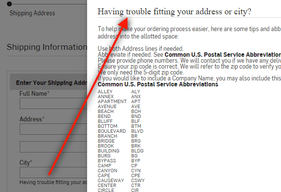
“Having trouble fitting your address or city?”
This address form has a link underneath the form fields to a pop out containing hints and tips for abbreviating your address. While this isn’t ideal, it would be preferable to use address lookup or only take key parts of the address, it helps users adhere to this form’s data requirements.

“Enter all 13 digits on your card with no spaces:”
This instructive message reminds the user that a proper card number is 13 digits long and warns them to enter it without spaces, a good distinction as many cards print the number with spaces. Ideally the form would allow entry with and without spaces, but if there are restrictions on how data can be entered, be clear and upfront about this.

“Check out faster next time with a MyLowe’s account. Create a password to enjoy faster checkout plus all the FREE benefits of MyLowe’s.”
This message comes at the end of a purchase form. Shoppers are not obliged to create an account in order to buy but this message highlights some great reasons why they should. Lowe’s say creating an account will mean ‘faster’ checkout next time and that account holders get ‘FREE benefits’.

“Only used if…promise!”
“To keep you updated on your order status”
Firebox are a pretty fiery company, the copy on their product pages doesn’t shy away from controversy and represents a very strong brand. However, when it comes to the microcopy, they know when to keep it simple.
They also know that people are pretty sensitive about sharing their personal information. They don’t force shoppers to provide a phone number, making the field optional, but also reassure you that if you did it would be strictly used to contact you about your order, “promise!”. Likewise with your email address, they tell you what they’re using for, “to keep you updated”.
Although I don’t recommend any quirky writing in instructional microcopy, there are some nice ways of keeping the voice brand flowing into the checkout process.

”Our couriers have a very particular set of skills. They will find you. They will deliver to you.”
This playful addition above the address form, parodying action movie, Taken, appeals to Firebox’s demographic. Notice though that the heading above it, “Where would you like this delivered?”, isn’t quirky, leaving the instructional copy alone.
User experience expert, Chris Callaghan, says the most persuasive button copy is outcome oriented, not task oriented.
“Make CTAs outcome modelled rather than task modelled to show the user what they’re going to get, not what they have to do” Chris Callaghan, @CallaghanDesign

“Click to get the formulas”
Not the strongest example of an outcome modelled call-to-action but it does focus on the result of clicking the button.

“Get My Free E-book”
Michael Aagaard, conversion optimisation consultant, found that using the word ‘Get’ in button copy increased conversions in a particular test by 14.79%.
Aagaard’s post, 10 Call-to-Action Case Studies, shares some interesting results from button tests.
Daniel Melbye, suggests alternatives to ‘Submit’ and ‘Donate’ try on donation pages:
“instead of “submit” try:
Errors trigger stress in users. Part of your error-handling strategy to get users over this pain point should be great error messages.
There are a few things you need to avoid in error messages, such as repeating the field label and writing copy that puts blame on the user e.g “Your entry does not comply”.
Sara Wachter-Boettcher’s talk, Everybody Hurts: Content for Kindness is an excellent reminder that we must write for real people and we need to sensitive.

“Please include ‘@’ in the email address. ‘hahzeefjlfd’ is missing an ‘@’.”
This error message is good for several reasons:
The message is dynamic too, giving a different message when I added ‘@’:

“Please enter a part following ‘@’. ‘hahzeefjlfd@’ is incomplete.”
With extra thought to the smallest of copy you can make great optimisations to your form’s user experience.


Zuko is the most powerful form analytics platform available on the market. Find out how to improve your form and checkout conversion by taking a product tour.
PRODUCT TOUR