This articles gives you detailed advice and best practice tips when asking users to create a password online.

When users create an account on your site, they will usually need to create a password. This, as far as online forms go, can be complex. You as the website owner want the password to be:
These three requirements often lead to password fields adopting some or all of the following approaches:
These techniques can lead to these fields being comparatively difficult for a user to complete successfully, and can therefore lead to use frustration.
We are committed to using data to improve forms so we did some digging into some Zuko usage data since January 2020, specifically looking at how often users have to return to password fields.

From the above we can see that, on average, almost 50% of sessions have to return to a password field after exiting it, and when they do return they do so an average of twice. In other words, 1 in every 2 people that try to set a password on the above sites get it wrong twice and only move on after the third attempt. That’s a significant amount of friction being put in the way of users.

Even in the best performing fields above, over 30% of users have to return to the password field at least once.

Similarly the lowest average number of field returns was over 1.5 times.
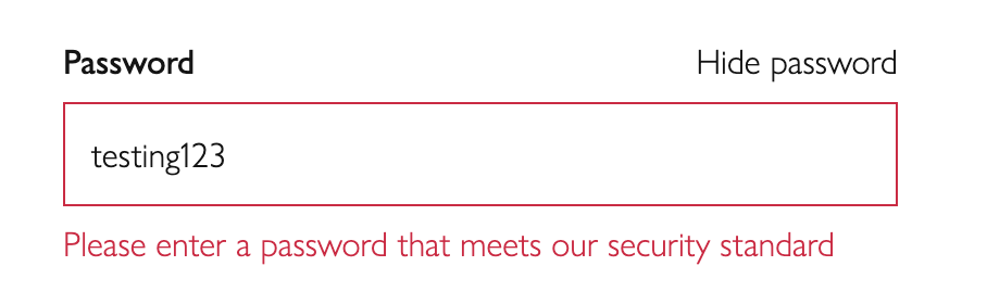
Short and simple passwords are easier to crack. Sites therefore have traditionally taken steps to force users to create passwords that contain a certain degree of length of complexity.
For example:

In the above, I have four different requirements on my password that I set. If any of them is not met, I have to choose a different password.
Baymard Institute lists two potential downsides to overly strict password requirements:
The first point consistent with data taken from Zuko - 50% of users return to the password field at least twice. This is a significant point of friction for users, and has a detrimental effect on UX.
Baymard also highlights the fact that since a f0rm may require a complex password, a user may ‘make up’ a particularly complex one and, without a password manager, simply not be able to log in further down the line since it would be almost instantly forgotten. The password reset function would therefore be used widely, which is not a great user experience.
“There are three general requirements for any password system that you will need to consider:
Other than the three requirements listed above, do not set restrictions on how users should create a password. Current research (see ‘Further reading’ below) indicates that doing so will cause people to reuse passwords across accounts, to create weak passwords with obvious substitutions or to forget their passwords. All this places unnecessary stress on your reset process.”
Microsoft also recommends avoiding complexity requirements, so despite them being a very common feature of online forms, they are hard for humans to remember. If you need further evidence, this XKCD comics summarises the issue well:

In short, password length requirements are fine (and good), but complexity requirements have a detrimental effect on user experience, and are unnecessary.
Whichever approach you use to enforcing password length and complexity, password fields offer you a chance to implement instant inline validation.
Rather than wait until the form is submitted, you can provide real time feedback to make sure you are letting users know how close they are to meeting your requirements.

This gives instant feedback, and does not punish a user for getting it wrong - instead it guides them to getting it right.
So a website wants you to be able to login after creating an account with a sufficiently long/complex password. So in order to make sure you set and remember the ‘correct’ password, often you’ll be asked to confirm your initial password entry:
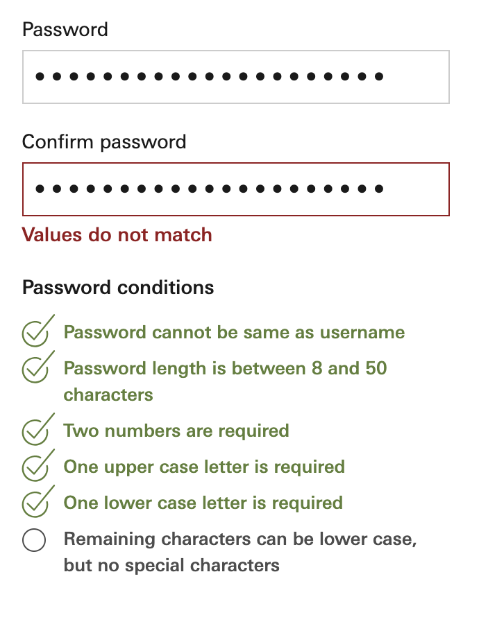
The logic goes - since you entered the password twice, you’ll be twice as likely to remember the password upon your return.
There are a number of problems with this approach.
You therefore have no way to correct either field. You simply have to delete both and try again, hopefully getting it right the second time around.

Take the fields mentioned previously that are confirm password fields:

They still are returned to often and create significant friction.
The password confirm field is worth cutting.
One way to help users reduce the amount of errors, and meet password requirements more easily, is to allow them to view the characters they are entering into a password field.
For example, they might be able to to click an icon to the right to unmask the field:

Or a more explicit toggle option to show the password:

Dr Jakob Nielsen argues that we should show most passwords as text when we type them. His article, Stop Password Masking, has the following summary:
Usability suffers when users type in passwords and the only feedback they get is a row of bullets. Typically, masking passwords doesn’t even increase security, but it does cost you business due to login failures.
Dr Nielsen also points out two side effects of masking passwords, one of which lowers security:
Users make more errors when they can’t see what they’re typing while filling in a form. They therefore feel less confident. This double degradation of the user experience means that people are more likely to give up and never log in to your site at all, leading to lost business. (Or, in the case of intranets, increased support calls.)
The more uncertain users feel about typing passwords, the more likely they are to (a) employ overly simple passwords and/or (b) copy-paste passwords from a file on their computer. Both behaviors lead to a true loss of security.
Dr Nielsen concludes that ‘It’s therefore worth offering them a checkbox to have their passwords masked; for high-risk applications, such as bank accounts, you might even check this box by default. In cases where there’s a tension between security and usability, sometimes security should win.’
Data taken from Zuko supports this:


Sessions that interact with unmasked password fields return to them at a far lower rate.
Zuko data also suggests that a relatively low number of people choose to unmask their passwords. This may be due to the UI being too subtle or ambiguous with users not knowing how to use the functionality.

We would support having the ability available, and testing out different implementations on your website visitors.
Is it possible to reduce the password requirements without sacrificing security? From Baymard Institute again:
A magic link is a unique URL sent to the email account you registered with. Each time you came to login, a new, unique link would be sent to your email address. Clicking the link would log you in, instantly.
Since you use a password to access your email, and if accessing on a device you would also need to unlock it via a fingerprint or passcode, the security is effectively being outsourced to your email account.
You would therefore not require the setting of a password at all in the account creation process.
Monzo uses this method to allow you to log in, and below are a couple of articles discussing potential implementation of this approach.
https://hackernoon.com/magic-links-d680d410f8f7
Some discussion of the downsides - https://adam.ac/blog/magic-login-links-are-not-ok/
Similar to the above, but instead of using email as the identifier, you would use a phone number instead.
Pulling this all together, here are our recommendations when designing and implementing password fields:


Zuko is the most powerful form analytics platform available on the market. Find out how to improve your form and checkout conversion by taking a product tour.
PRODUCT TOUR