.svg)
Inaccessible sites lose sales. Let’s look at the numbers:
Accessibility in an online context is the practice of ensuring that the web is inclusive and that there are no barriers to prevent interaction with the web and its components. This includes those with physical disabilities, situational disabilities, and socio-economic restrictions on bandwidth and speed.
Though primarily accessibility is aimed to improve the web for people with disabilities, it also improves the web for everyone, including:
By improving the accessibility of your website, you improve the experience for everyone, and ensure that your website does not isolate and marginalise any group of your users.
The Web Content Accessibility Guidelines (https://www.w3.org/TR/WCAG20/) are organized around four principles often called by the acronym POUR:
These guidelines are there to steer the design and implementation of all websites and their components, but are also applicable to online forms.
Online forms represent some of the most complicated interactions a user can have with a website. Different components, inputs, images text and field are combined to ask for sometimes complicated information formatted in a particular way.
Forms are difficult enough to complete on a desktop computer by an able user in a comfortable environment, let alone if one or more of those factors are changed or limited.
Form accessibility is described as “their accessibility to people who use screen readers or keyboards.” WebAIM goes on to say “that everyone benefits from a well-organized, highly usable form, especially those with cognitive disabilities.” So why should you invest time and resources into improving your forms’ accessibility?
5 reasons:
Fact is, the more accessible your forms are, the more opportunity you have to boost conversions and revenue. The effort you put in will be rewarded with increased signups and sales. Let’s get to it.
The tabbing order is a method of marking up a page such that users tab through links and interactive elements in the order you want them to. Go to your form and navigate it using the tab key to check every field is accessible and that navigation flows in the way you’d expect.
Keyboard navigation is important to three groups of people:
It’s confusing when tabbing order isn’t intuitive.. Worse still, if an element isn’t accessible via the keyboard your users might not be able to complete the form.
Keyboard navigation on mobile should make it faster and more accurate to move between form fields. But, if the tabbing order is incorrect then the screen could jump around or the user might miss fields that aren’t marked up.
HTML links, buttons, and form fields (i.e. anything with input type =”x”) are naturally accessible, <div> or <span> elements are not. The tabbing order follows the sequence of the interactive elements in the source code. Elements can be styled such they appear in a different order on the page to their position in the source code.</span></div>
To see what it’s like when the tab order doesn’t match the visual presentation watch the first 30 seconds of this video:
It’s better to write source code that reflects the visual flow of the page however, you can manipulate the tabbing order with tabindex. This allows you to mark up elements that aren’t recognised as interactive e.g. divs, or changing the order of focus.
To create a tab index simply add tabindex=”#”, giving each instance the numerical order you want it fall in e.g.
<input type="text" id="name" tabindex="2">
The tabbing order is for the whole page. If your source code creates a logical tabbing order but you’ve got a Javascript widget that needs to be added then you can use tabindex=”0”. This makes the element navigable in the order “relative to element's position in document”.
Your form field labels should be as clear as possible. The Baymard Institute found that “92% of top ecommerce sites have inadequate form field descriptions in their checkout process”. For users hearing form field labels via a screen reader the context is lost and so the label is even more important.
In Design Modo’s Ultimate UX Design of the Credit Card Payment Form they encourage you to be as obvious as possible.
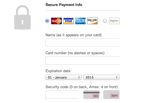
In the example from Threadless the labels read “Name (as it appears on your card)”, “Card number (no dashes or spaces)” and “Security code (3 on back, Amex: 4 on front). This avoids hesitation and errors, helping users complete the form more quickly.
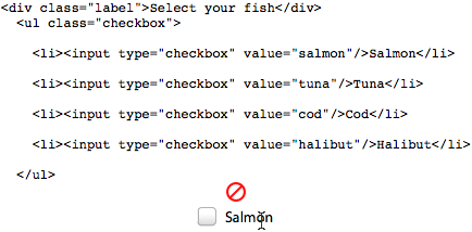
Field labels aren’t always marked up with a label tag. With CSS they can look like a label. Indeed, visually, they’ll look fine. However, they’re not accessible because, without a label tag, the text has no association with its corresponding field.
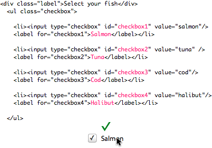
Label tags also increase the clickable area of the input field, making it easier for users with limited dexterity to select the form field they want to interact with.
Without a label tag:
With a label tag:
The alignment of the label to the field doesn’t matter as much when viewed on desktop. Fact is, very few studies agree on where exactly is best to put a form label:
Formulate have questioned the methodology and aims of these studies, most recently in the blog post “Infield top-aligned labels: use with care.”
However, for mobile devices you’ll save on page width by putting the label above the field. Luke W gives a brief explanation of the pros and cons of top, right and left aligned form field labels.
The danger for accessibility comes when you put the label inside the form field. Doing so causes usability issues for everybody and are just plain bad for blind people, people with low vision, poor short-term memory and those with dyslexia. Here’s why:
If you still want to use labels inside form fields follow Stefano J Attardi’s guide to implementing labels. The guide shows how to use Javascript to keep the label fixed until users start typing. This allows screen readers to read the label and sighted users to see the label until they start typing.
If your form is viewed frequently on mobile then save on page width by placing the label above the field.
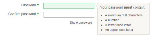
In addition writing easy to understand labels you should also specify the data format you require, if you require one. Password creation is a good example of this. If your password validation is strict then tell your users upfront how to pass it first time by listing the criteria.
Date fields are an example of where data formatting could be an accessibility concern. Around the world different countries use different date formats (hello American cousins). Specify DD/MM/YY, DD/MM/YYYY or MM/DD/YY in the field label so it’s clear as early as possible what format you expect.
Calendars provide context that can aid date selection. In a survey on travel websites, 71% of respondents said they found it helpful to see dates either side of the ones they’d chosen. Make sure to use a datepicker that’s keyboard accessible.

Name fields can cause accessibility problems too. Portuguese names are extremely long, so fields with character limits often stop users from completing the form. In some cultures people don’t have first names and surnames. A single-field with no character limit that asks just for ‘Full name’ or ‘Name as it appears on payment card’ should eliminate lost conversions caused by cultural inaccessibility.

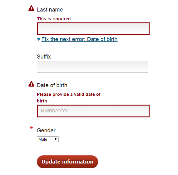
Users make mistakes. Clear labelling and flexible data formats help to prevent errors but you also need to allow errors and make your error messaging helpful.
If a user makes a mistake which they find difficult or impossible to correct they’re likely to quit your form. Helpful error messaging can save a conversion that’s on the brink of being lost.
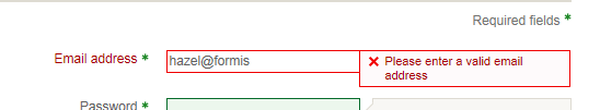
Never rely on a visual cue alone to indicate an error e.g. just highlighting the question in red. Blind and colour-blind users won’t be able to see that there’s an error. For that reason alone you need a good error message.
The other reason to write a good error message is to help users understand the problem so they can fix it. Error messages that repeat the field label (e.g. “Email” beneath the email field) won’t clarify the question.
Your error message should tell the user the reason for the error and/or clarify the question. So a field that has generated an error because it’s been left blank could have an error message “This is a required field.”
For things like email address you can try to detect typos and suggest edits before an error occurs. If a credit card number is too short tell the user that instead of a vague message like “Please enter a valid card number.”
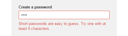
Gmail’s signup form detects the error and adapts the error message accordingly. See the example from the password field. In the first instance the password is too short, so Gmail feedback an error message “Short passwords are easy to guess. Try one with at least 8 characters.”
In my second attempt I filled the field with special characters e.g. £%*%(*). This time Gmail’s error message read “The following are allowed in your password: a-z, A-Z, 0-9 and common punctuation.
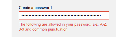
I would prefer if the criteria for password creation had been previously stated but this is a good example of adapting the error message to the error.
Remember to mark up the error message as a label so that screen readers identify it properly.
How users access the error field is important. Inline validation validates the user’s input as they type it and feeds back an error message immediately if there’s anything wrong. This is helpful to all users but particular useful to those who would find it difficult to navigate the form to correct mistakes retrospectively e.g. users of accessibility software.
Luke Wroblewski ran some experiments with inline validation and found that it:
Check out these instructions on validating forms with HTML5. Alternatively, Nomensa’s Matt Lawson has a jQuery plugin for accessible form validation.
If you don’t use inline validation there are alternative ways to ensure errors are obvious to users, even blind users. Upon validating the form, change keyboard focus to the first field with an error. This will alert the the user to the error and allow them m to correct it quickly.
You can also add a links to allow keyboard users to navigate straight to the next error, as demonstrated by SimplyAccessible.
Icon fonts are vector icons that are often used to add a graphical representation of an idea e.g. an icon of a person to represent the idea of users or username.
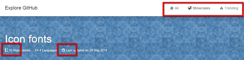
Icons are used on lots of sites throughout the page, the Github website is a good example.:
Icon fonts are used in forms too e.g. alongside email address fields, password fields etc.
No matter how pretty they look, what matters is conversions. They can pose harmful accessibility issues that negatively affect your conversion rate. Some software for dyslexia uses a system font that’s incompatible with icon fonts. In the example above the form uses icon fonts and places the label inside the text field. They commit a double sin here; disappearing labels and, if you’re using certain software programs, the inability to see the icon fonts. As you can imagine, it’d be difficult to finish the form in those circumstances.
Seren Davies, in her presentation Death to Icon Fonts, showed a screenshot of a page that uses icon fonts. She’s also using a system font that overrides the text on the page to make it easier for her to read.
<script async class="speakerdeck-embed" data-slide="19" data-id="fcfca49087d04571a050ba2e9e663f36" data-ratio="1.33333333333333" src="//speakerdeck.com/assets/embed.js"></script>
As you can see the icon fonts all look like rectangles.
Icon fonts have to be downloaded and are often very large, slowing down the web page. 40% of users will bounce if a web page takes more than three seconds to load. By ditching icon fonts you’ll help dyslexic users and speed up your site.
SVGs (Scalable Vector Graphics) are graphics defined in XML format. They’re a great alternative to icon fonts because they’re still scalable, but they have smaller file sizes and they’re not fonts. This means they won’t break if users apply a system font, and they won’t slow down your site.
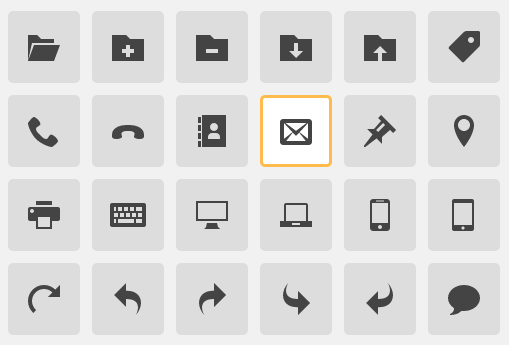
Image Source: IcoMoon
Having a debate in your design department? Use this table to compare SVGs versus icon fonts.
Drop down menus require users to interact several times in order to access the menu and make their selection. For users with restricted motor skills or keyboard users it takes even longer to interact with a drop down menu.
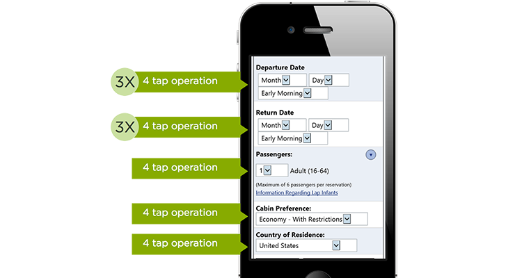
Typing requires less effort than making selections from drop down menus, where users must scroll to find the relevant answer.
Autocomplete, where suggestions appear below the form field based on what the user is typing, can make form filling even faster and avoid the need for dropdowns e.g. Country of Residence selection or internal site search. When Printerland enhanced their internal search they found visitors who interacted with autocomplete suggestions were 6 times more likely to convert.
Key takeaways
When you design for accessibility, you increase user experience for all. Better user experience can boost conversions, so it’s not a hard decision to make. A good rule of thumb is to always choose the most inclusive option. If there’s a more accessible way of designing or coding your form, why lose out on conversions by not choosing it?
https://developer.mozilla.org/en-US/docs/Learn/Accessibility/What_is_accessibility
https://uxdesign.cc/5-ways-to-make-web-forms-accessible-fb3ccb9f1752
https://webaim.org/techniques/forms/
https://www.w3.org/WAI/tutorials/forms/
https://www.nomensa.com/blog/2010/how-improve-accessibility-web-forms
https://developers.google.com/web/fundamentals/accessibility


Zuko is the most powerful form analytics platform available on the market. Find out how to improve your form and checkout conversion by taking a product tour.
PRODUCT TOUR